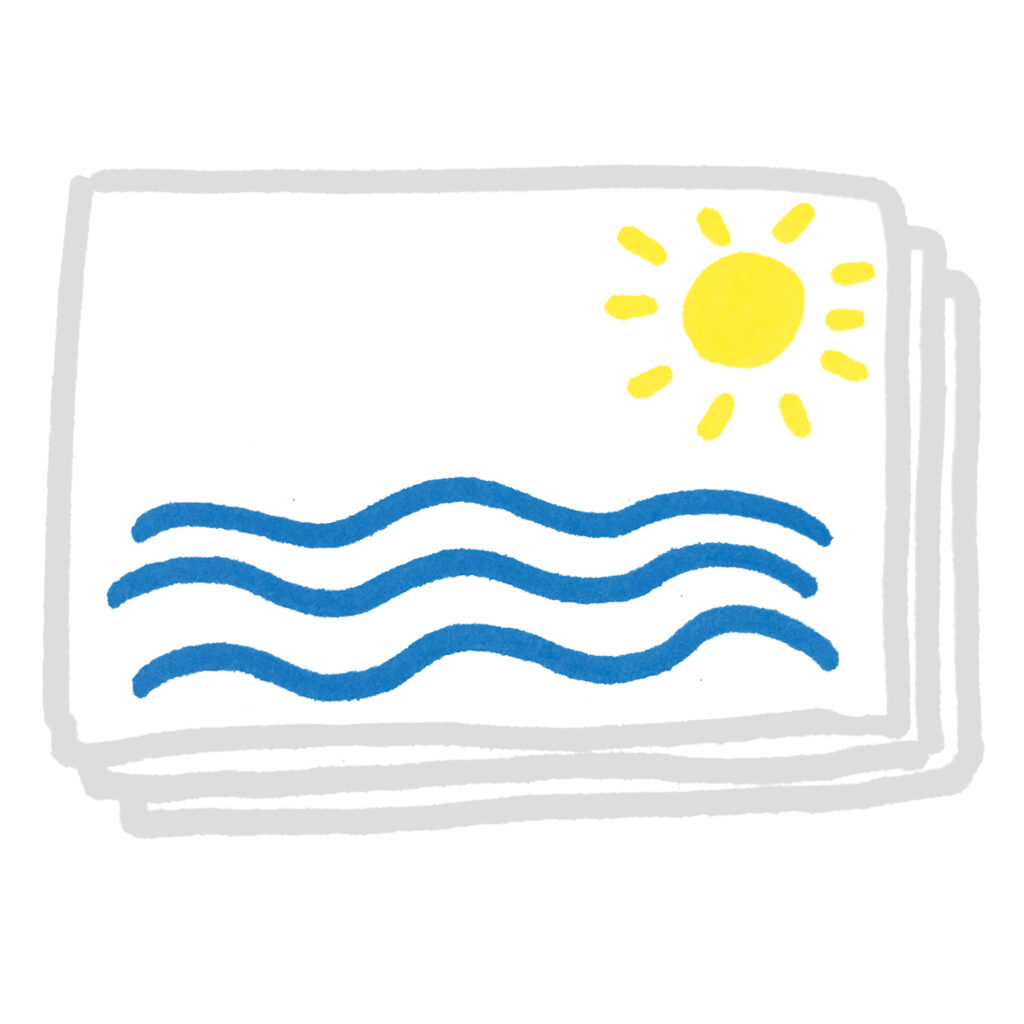
RISO basics


RISO turns your greyscale artwork into bright, colourful risograph prints.
The darker the artwork, the more ink is printed. Black prints solid, white stays white, and lighter areas appear as pale tones.
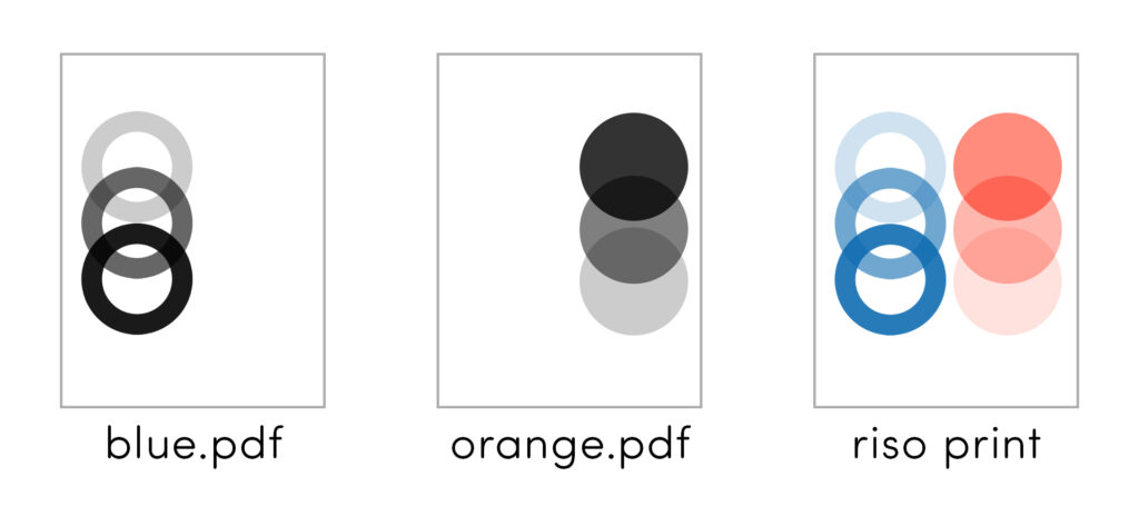
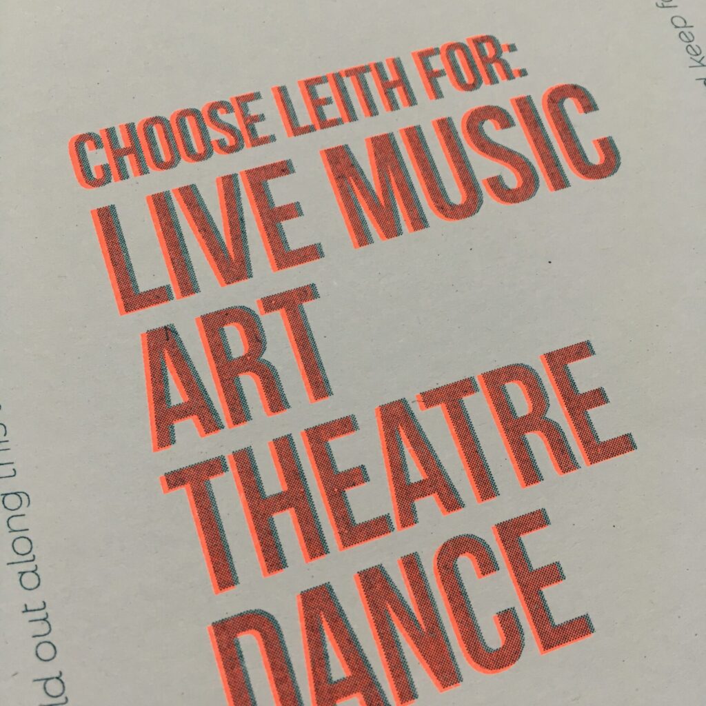
Each ink colour is printed separately
A two-colour print in blue and orange requires two greyscale PDFs – one file with all the blue artwork and one with all the orange artwork.
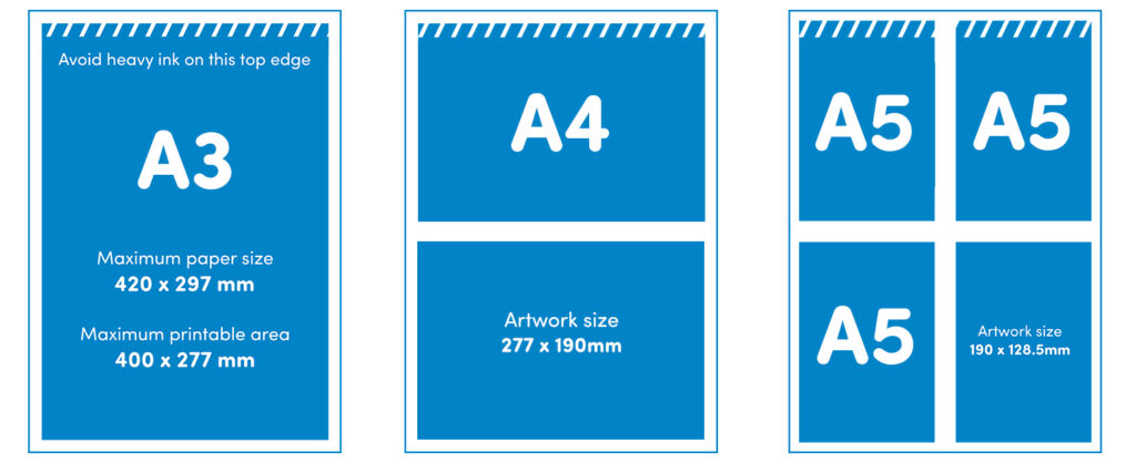
RISO prints up to A3 size
Make the most of your print by tiling any smaller artwork onto an A3 sheet. Remember to leave blank 10mm margins on each edge.
Step 1:
Create your design
Make one layer per colour. Each layer should be greyscale. You can use tracing paper, a lightbox, or digital tools like Photoshop, Procreate or InDesign.
Step 2:
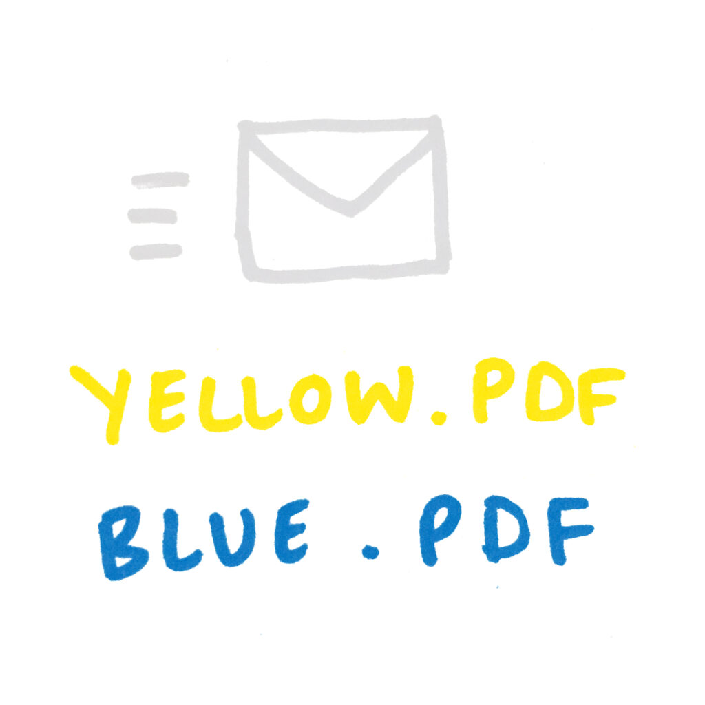
Send us your artwork
Email a separate PDF for each colour layer to blueprint@outoftheblue.org.uk with the number of copies you want, paper type & any other details we might need.
Step 3.
We’ll print it!
We’ll print each colour one at a time and leave them to dry between each layer. Once they’re ready, come and pick them up from our studio in Leith.
RISO INKS
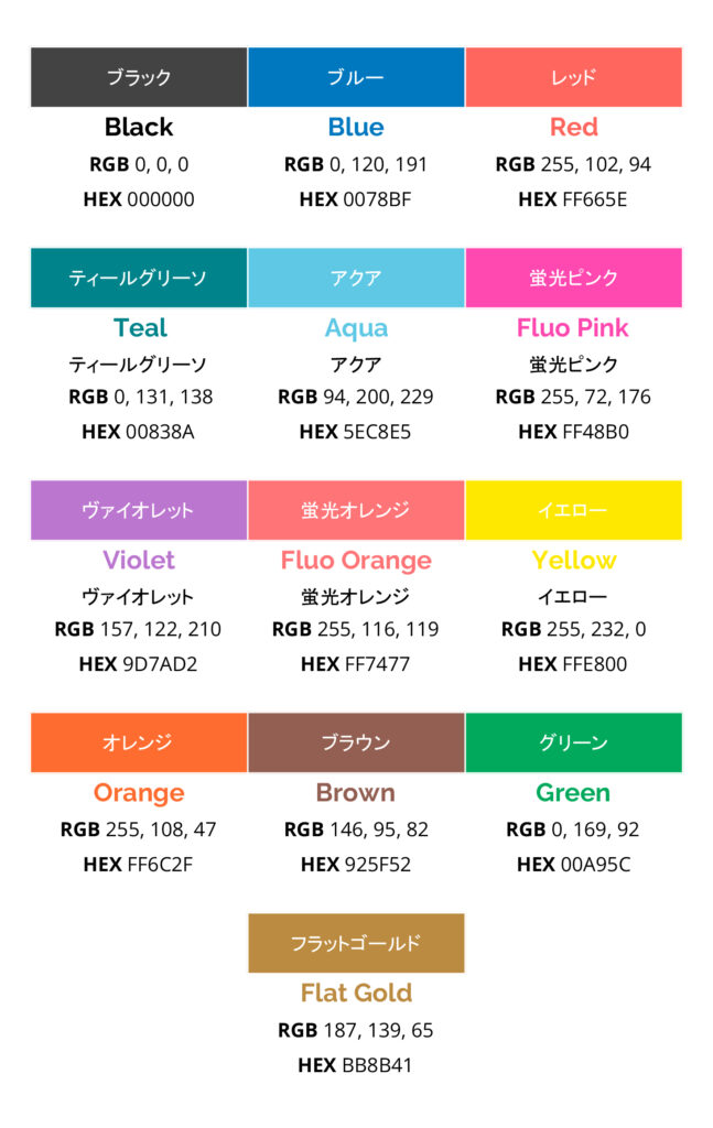
We have 13 ink colours in the Blueprint studio.
These are black, blue, red, teal, aqua, fluorescent pink, violet (new! recently changed from purple), fluorescent orange, yellow, orange, brown, green, and flat gold (new!).
You can use any combination of these.
Most people stick to 1-4 colours per print.
How the inks work
Each colour is printed separately using its own master stencil.
The darker your original artwork, the stronger the ink will print.
100% black = full ink coverage
Greys = lighter tones
White = no ink
One common mistake is to design in colour then hit ‘greyscale’ – that makes everything come out much paler.
You should also double check that your background is completely white – any paper texture will be caught by the riso. It’s always best to adjust the contrast/levels before sending to print. If in doubt, up the contrast!
Sustainable
RISO inks are made from rice bran oil, a byproduct of the Japanese food industry. They’re non-toxic and eco-friendly.
Imperfect
Inks can smudge easily, and you can sometimes get roller marks with multiple colours or double-sided prints. These can usually be cleaned up with an eraser.
Unique
Riso prints will never look exactly how you expect them to – that’s all part of the charm! No two prints are exactly the same, and ink coverage varies from print to print.
PAPER
Choose your paper type, colour and weight
We use 135gsm Context Natural as standard, and have a limited selection of other papers to choose from. All of our paper stock is recycled and FSC approved.
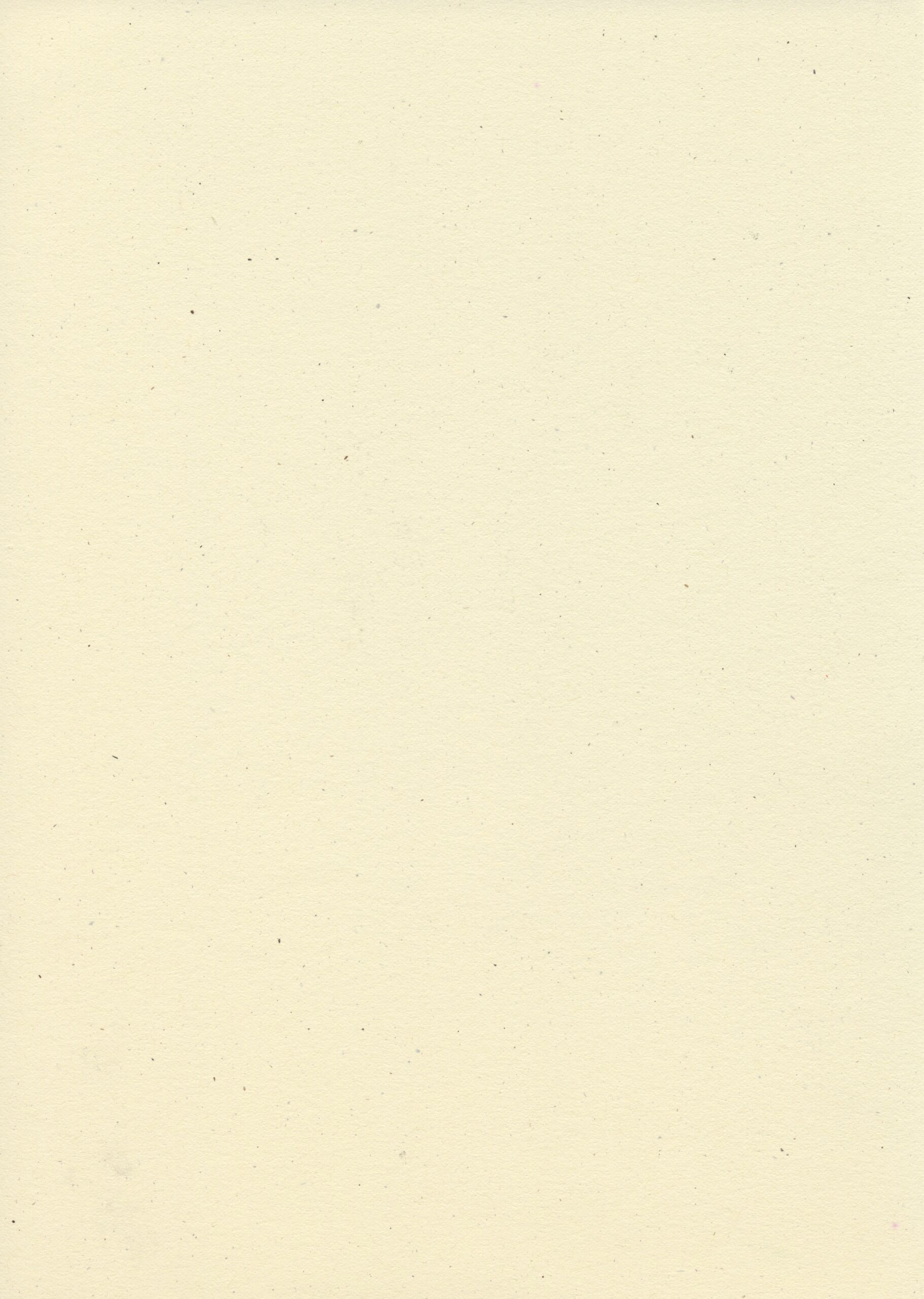
Standard paper
Context Natural 135gsm
Off-white with a smooth clean surface, made entirely from post consumer waste.
Also available in 190gsm (special)
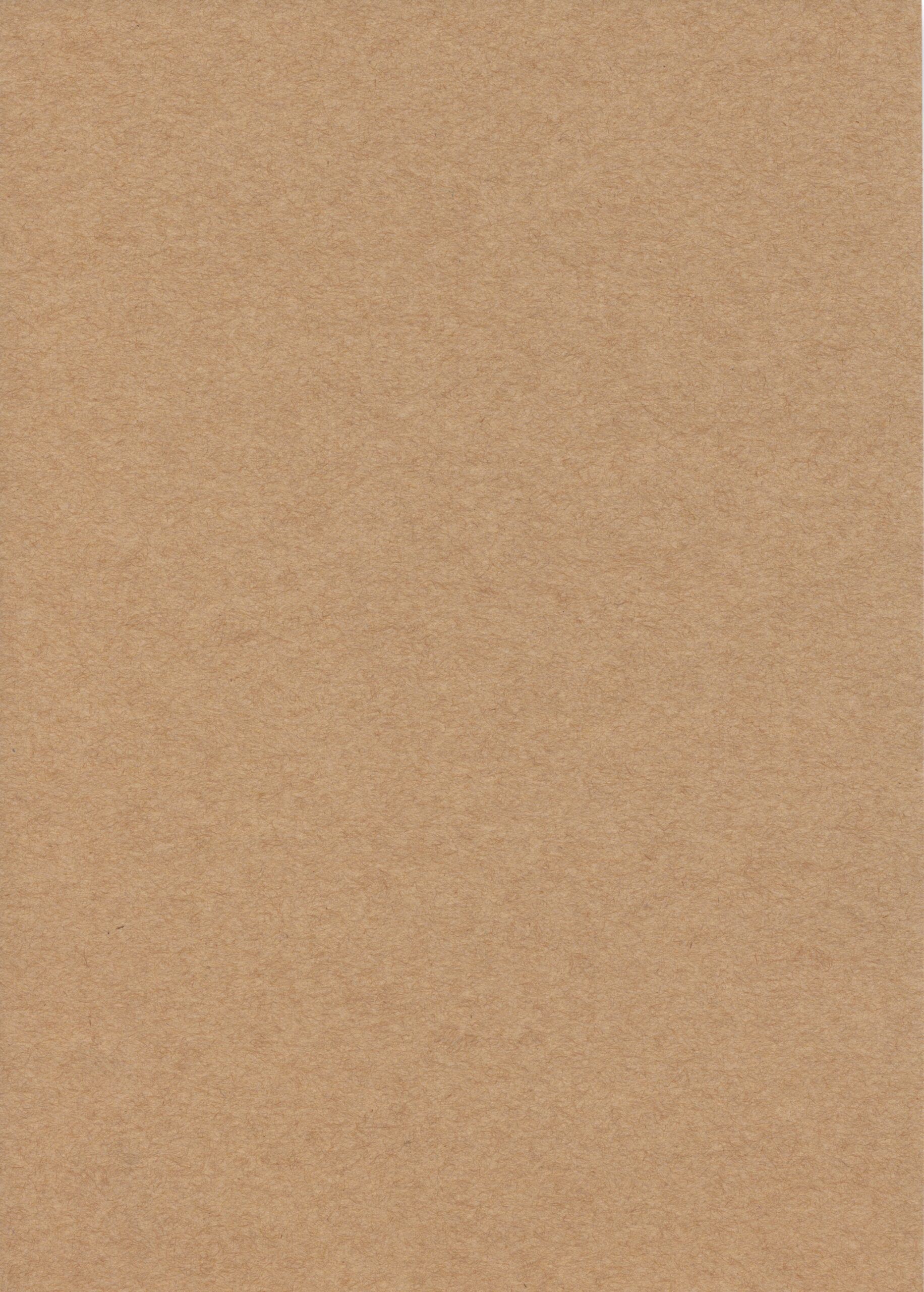
White Sugarpaper 140gsm
Coarse paper that comes in a range of neutrals with a textured, flecked surface. Good for posters, flyers and lo-fi zines. Can fade a little over time if left in direct sunlight.
Special paper
Context Natural 190gsm
Off-white with a smooth clean surface, made entirely from post consumer waste.
Also available in 135gsm (standard)
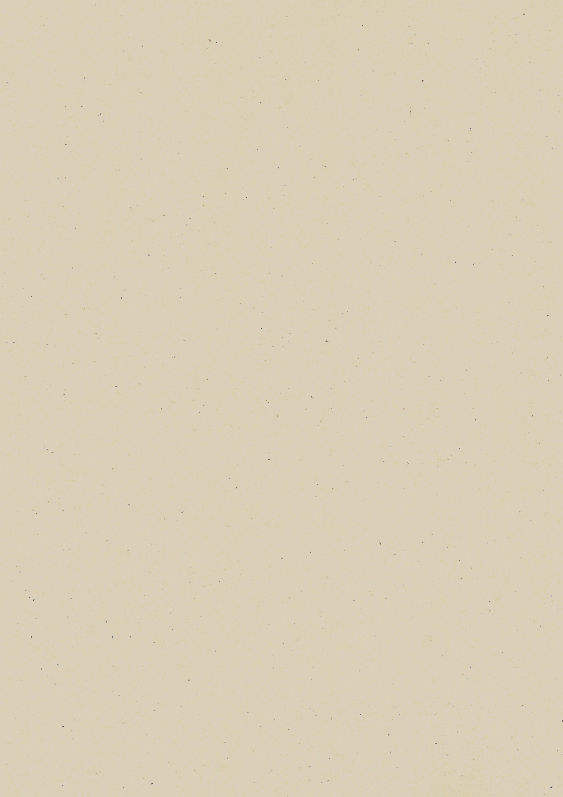
Context Birch 110gsm, 140gsm
Ivory/cream with a smooth surface and subtle flecks.
Also available in 225gsm (premium)
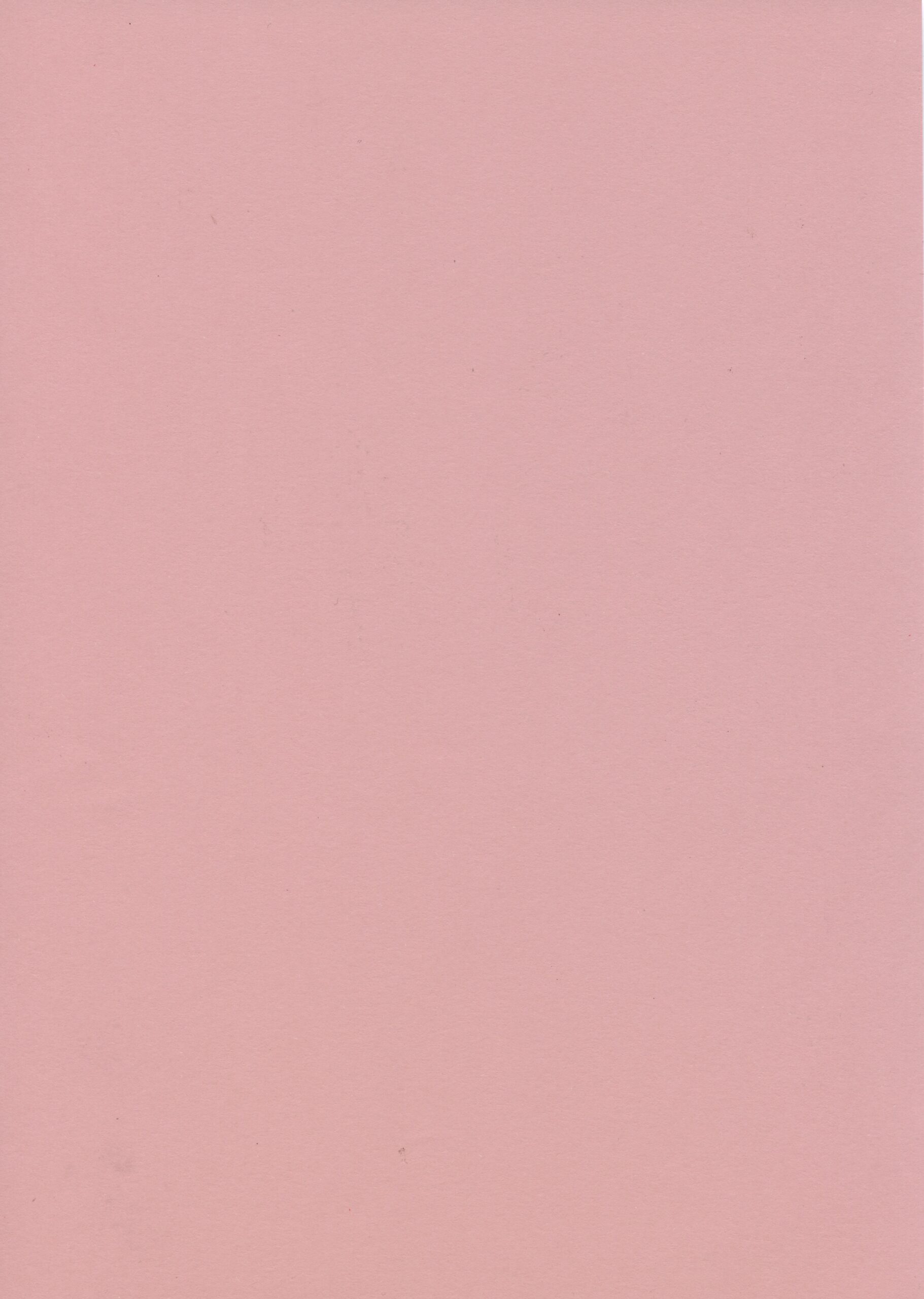
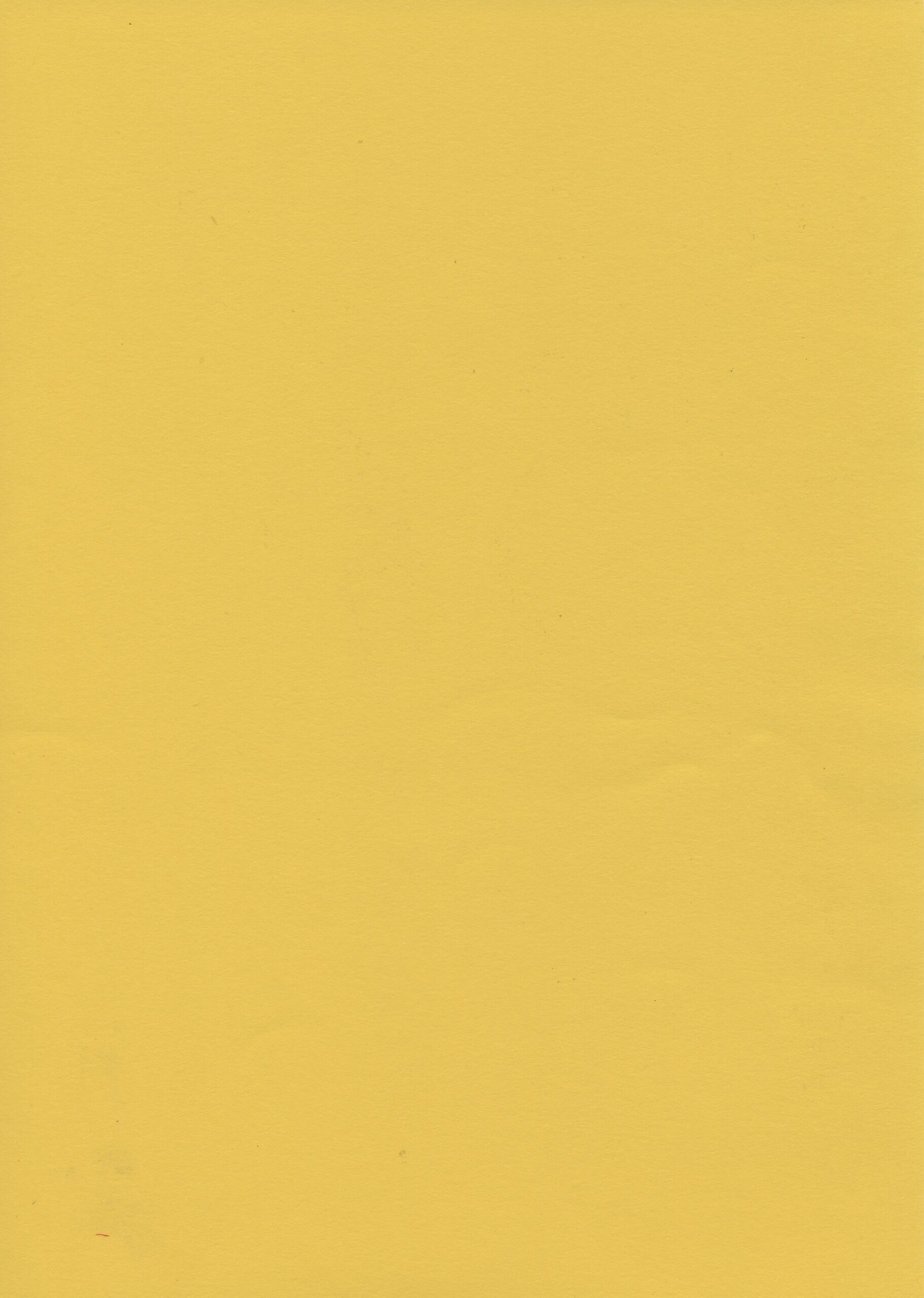
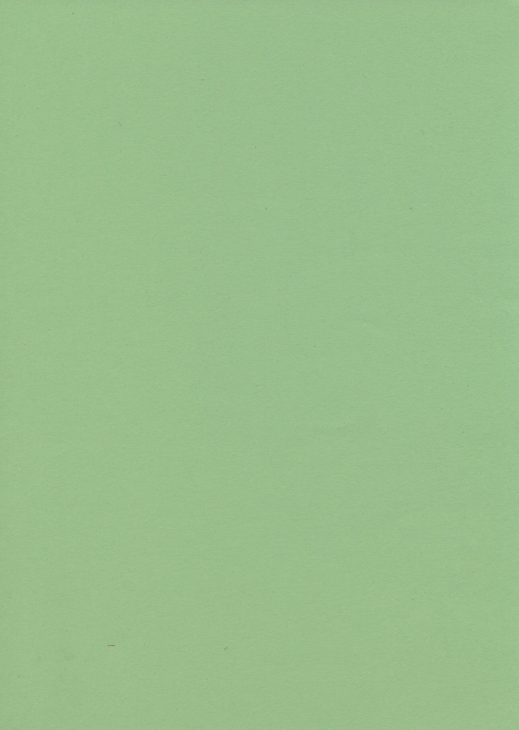
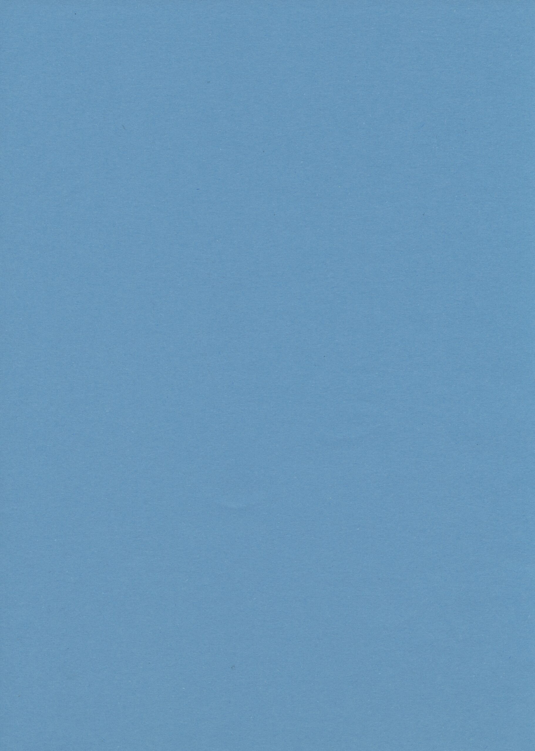
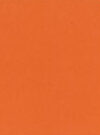
Context Colours 140gsm
Available in azure, salmon, yellow, green and orange.
Loop 120gsm
Our most eco-friendly stock: certified carbon neutral and made with wind power.
Available in Milkweed, Husk and Straw.
Premium paper
Context Birch 2225gsm
Ivory/cream with a smooth surface and subtle flecks. Used for postcards and greeting cards.
Please note all papers are subject to availability. If we don’t have your preference in stock, we’ll suggest a suitable alternative.
Expert tips
Now you know the basics, take your prints to the next level!
How to avoid common mistakes
- Design in greyscale from the start
Working in colour then converting to greyscale means your print may come out too light. If you do start in colour, be sure to adjust contrast / levels before sending artwork to print. - Check your backgrounds
Make sure your background is pure white.
Paper textures, off-white backgrounds or faint marks will show up as ink when printed. - Flatten your files
Using photoshop? Remember to click Layer > Flatten image before you export your files. - Remember your margins
RISO can’t print to the edge of the page. Make sure there’s no artwork in the outer 10mm of your design.
Type
Use registration black for best results with small text (12pt or smaller), even if you’re not printing in black ink. This helps the RISO print text more sharply.
Avoid setting type in Photoshop. Photoshop rasterises text (flattens into pixels instead of vectors), which means the RISO doesn’t ‘read’ it as text.
Avoid overprinting colours for body text. Any misalignment will make the text very difficult to read.
Steer clear of white ‘knockout’ text. RISO will print the surrounding shape, not the text itself, which can affect legibility especially on two-colour prints (or more).
Photographs
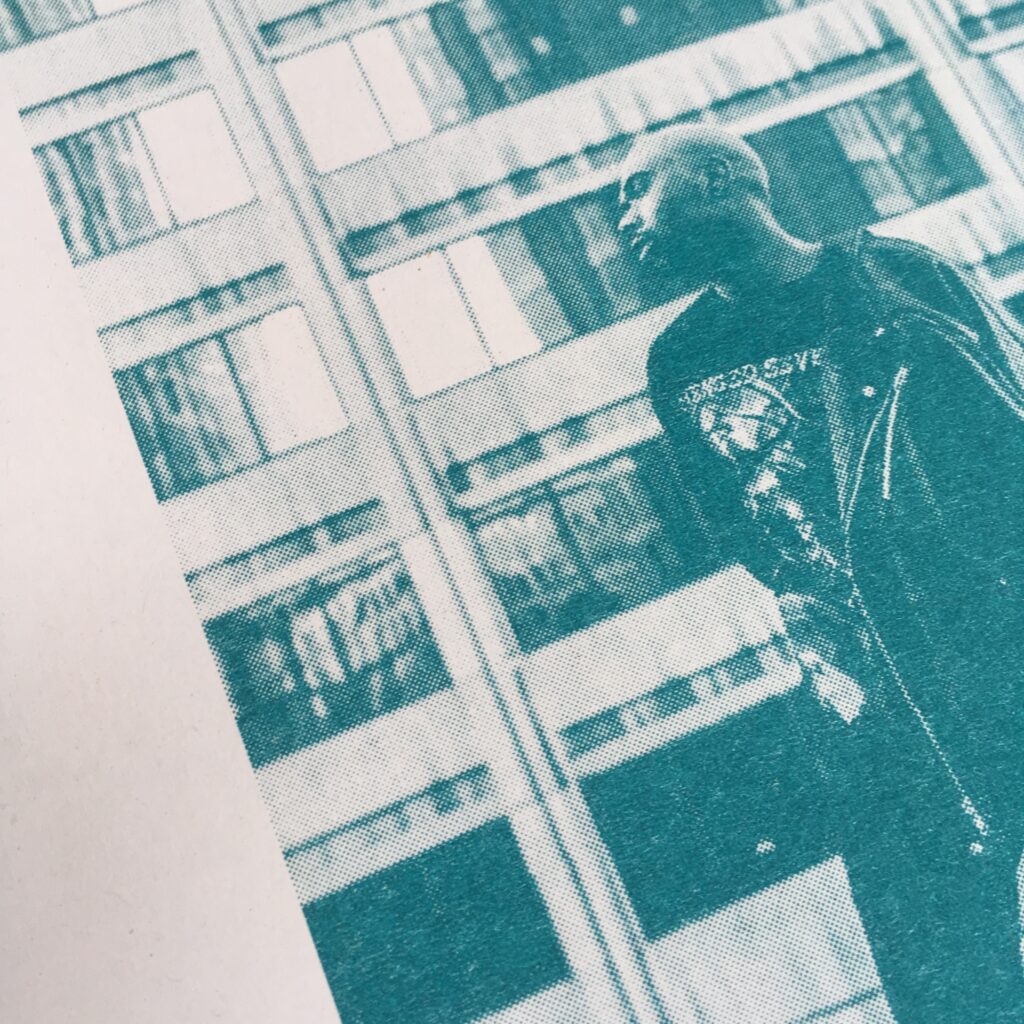
Monochrome photos work well – if it looks good in black and white, it’ll print well in RISO.
For best results, boost contrast. RISO prints often come out lighter than expected.
For colour photos, try using fluorescent pink, yellow, and blue to mimic CMYK (we prefer leaving out the black). You can also try fun combinations like teal, yellow, and fluo orange instead. If you’re not comfortable separating channels in photoshop, try Spektrolite – a free app that generates riso layers for you.
Overlays
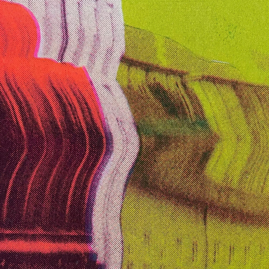
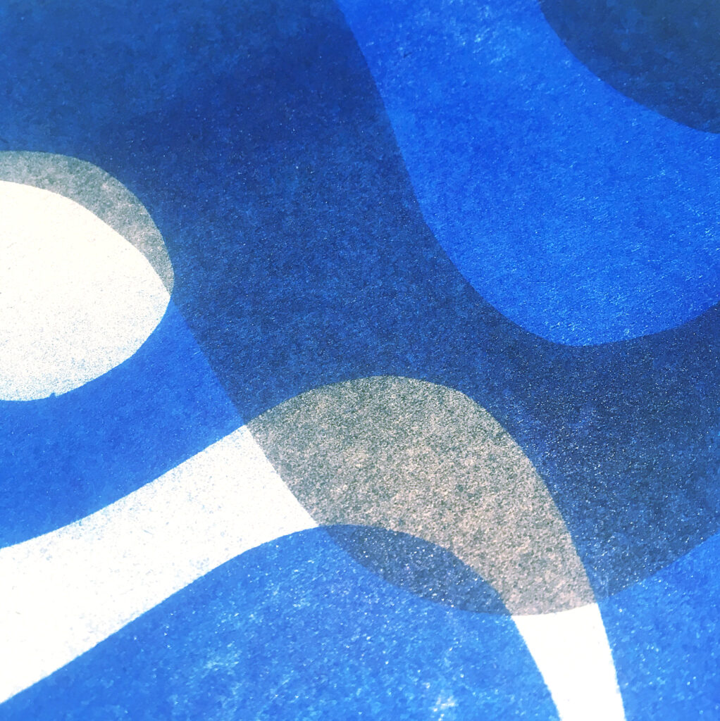
RISO inks are semi-transparent, so overlapping ink colours creates more colour options.
Use the ‘multiply’ blend mode in photoshop, procreate or indesign to preview how your layers will look when printed together.
Misregistration
Colours are printed one at a time, so they don’t always line up perfectly. This is called misregistration, and it’s an inherent part of the process that makes each print unique.
Avoid overlapping fine details or text, as layers can shift up to 3mm in any direction.
You can sometimes use trapping to help colours overlap cleanly, or just embrace the wonkiness!
Heavy ink
RISO isn’t built for full pages of ink – too much ink means the paper sticks to the ink drum and causes all sorts of problems! Large areas of solid colour can have inconsistent ink coverage. Aim for no more than 75% ink coverage per layer.
If your artwork has too much solid black it can crash the print drivers which means the file just won’t print. In these cases we suggest that you reduce the intensity of coverage, or even invert the design to have more white areas than black.
Heavy ink at the top edge of your print can be a problem, and often causes inky roller marks or a line of ink dragged down the centre. If the bottom edge has less coverage, simply rotating your design 180° can help avoid this.
Halftones
RISO automatically processes greyscale files into a bitmap, turning grey tones into dots using either the default grainy texture (Grain Touch) or a halftone pattern (Screen-covered).
We’re usually pretty good at choosing the right options for each image, but if you want to use a particular setting please specify when sending in your files.
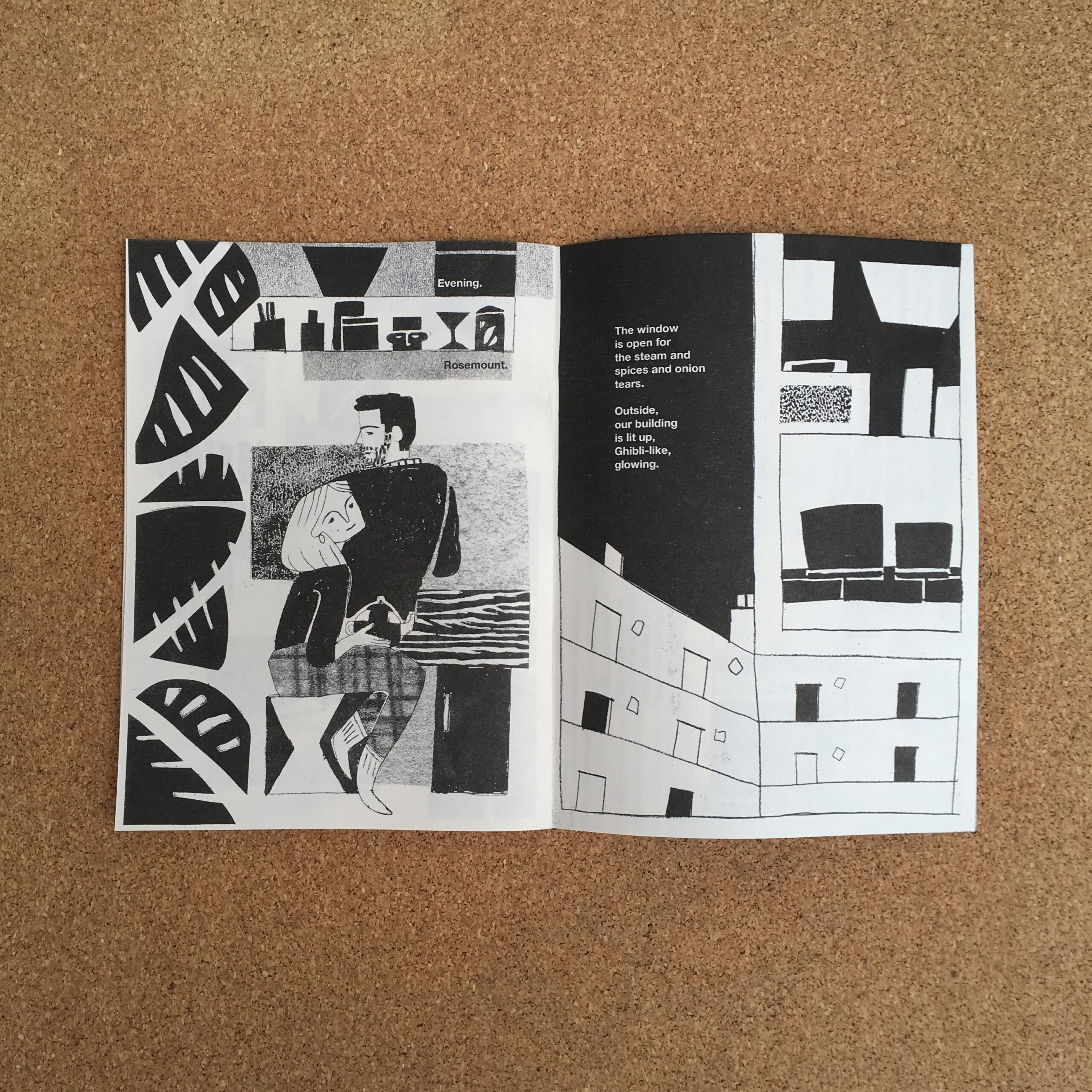
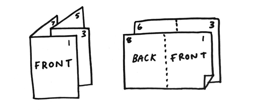
Booklet setup
Make your booklets riso-ready
Booklets need to be paginated before print. This means laying out each page side-by-side, so the front cover is next to the back cover.
Your booklet must have a multiple of 4 pages. We can staple bind up to 40 pages in-house, and can outsource perfect binding to our trusted finishing company.
We recommend making a physical mockup of your booklet to make sure all your pages are in the right place.
Sending your files
Print file checklist
- Create a separate grayscale PDF for each ink colour
- Label your files clearly, eg. artworkname_inkcolour.pdf
- Your file should be A3 size (420 x 297mm)
- Leave a minimum of 10mm blank margins on each edge (maximum printable area of 400 x 277mm)
- Files should be 300dpi resolution
- Flatten any layers before exporting your PDF
Sending your files
- Email your PDF files to blueprint@outoftheblue.org.uk
- If they’re too large to send as email attachments, please use WeTransfer (not Google Drive, Dropbox etc)
- Confirm how many copies
- Tell us which paper you want
- Please include a full colour proof of your final design
- Confirm any other details (eg. number of pages)
- Tell us if you have a deadline you need to collect by
Contact details
Out of the Blueprint
The Drill Hall
32-36 Dalmeny Street
Edinburgh EH6 8RG
Tue – Fri, 10am – 5pm
pickup by appointment
blueprint@outoftheblue.org.uk
0131 555 4604
Out of the Blueprint was set up in 2015 as part of the #artcore youth arts project, supported by Creative Scotland’s
Time to Shine initiative, Young Start and The Robertson Trust.
We are currently supported by the William Grant Foundation, and the National Lottery via Creative Scotland.